

Timeline
15 weeks
Team
2 Project Managers
6 UI/UX Designers
4 Graphic Designers
My Role
UI/UX Design Director
Project Manager
Client
Loyola Wellbeing & Emotion Lab
Rebecca Stilton
PROBLEM
Loyola Wellbeing & Emotion Lab wanted to translate rich, evidence-based sensor data into real-time guidance that actively boosts positive wellbeing.
Although smartphones and wearables quietly capture users’ activity, environment, and physiological signals, there’s no clear path for turning that raw data into personalized, moment-to-moment support for cultivating positive emotions.
SOLUTION

Seamlessly combines passive sensing
Automatically captures steps, heart rate, screen time, and ambient light from a user’s phone or smartwatch

Delivers personalized, evidence-based insights in real time
Uses algorithms grounded in the Loyola Wellbeing & Emotion Lab’s research to identify each user’s unique “vitality drivers”

Focuses on a holistic view of wellness
Encourages small, manageable actions that boost positive emotions rather than fixate on eliminating negatives
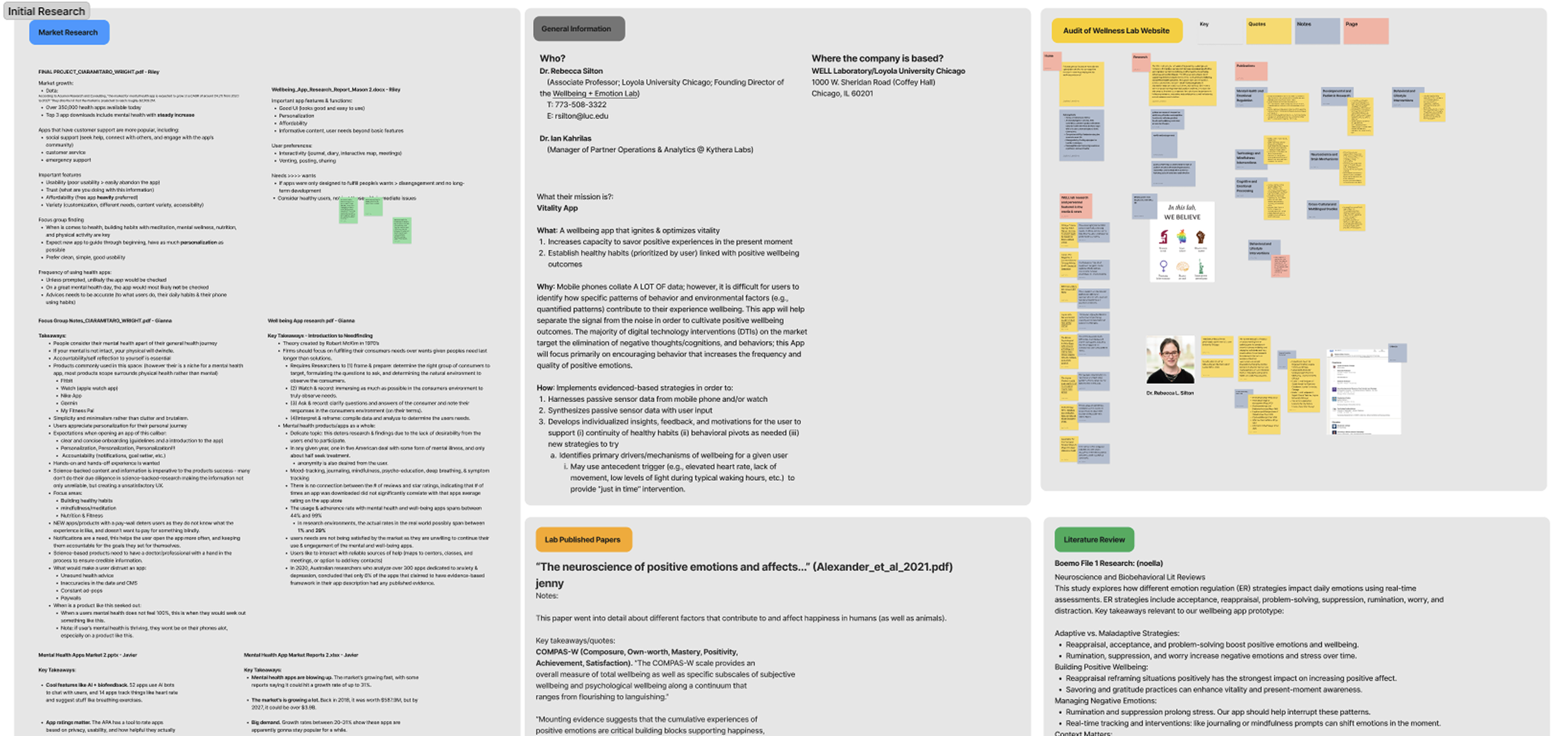
WHITE PAPER RESEARCH
We reviewed the research papers from Loyola’s Wellbeing & Emotion Lab, we distilled four key insights that guided our design decisions
Prioritize ease of use and accessibility
Avoid reliance on self-reported data
Promote long-term engagement and retention
Include popular features, but ensure they address real user needs
COMPETITIVE ANALYSIS
Our competitors were either heavily focused on fitness or leaned too much into mental health.
We envisioned Vitality as a holistic wellness app—covering both mental and physical health—without making users feel like they’re broken or forced to log activities every day.

storyboarding
Based on the client’s research, we developed storyboards to illustrate the user’s journey and validate our assumptions


USER SURVEYS + INTERVIEWS
We surveyed over 50 users and interviewed more than 10 to uncover their needs for a wellness app and pinpoint where existing solutions fall short.
Participant Profile & Behaviors
Majority were college students (ages 18–25)
Over 50 % had used a mental wellness app before
67 % expressed interest in connecting the app to a wearable
Many wanted fitness features baked into their wellbeing tools
Usage Patterns & Context
Preferred opening the app once in the morning and once in the evening
High interest in guided meditation and mindfulness exercises
Design & Feature Preferences
Flexible & Customizable
Personalized Reminders
Minimalism with Visual Imagery
how might we
design a solution that empowers users to enhance their vitality, enabling them to fully savor and appreciate positive experiences in the present moment, while fostering the development of sustainable, healthy habits that lead to measurable improvements of wellbeing?
SITE MAP
After synthesizing the research we made a site map of the app.
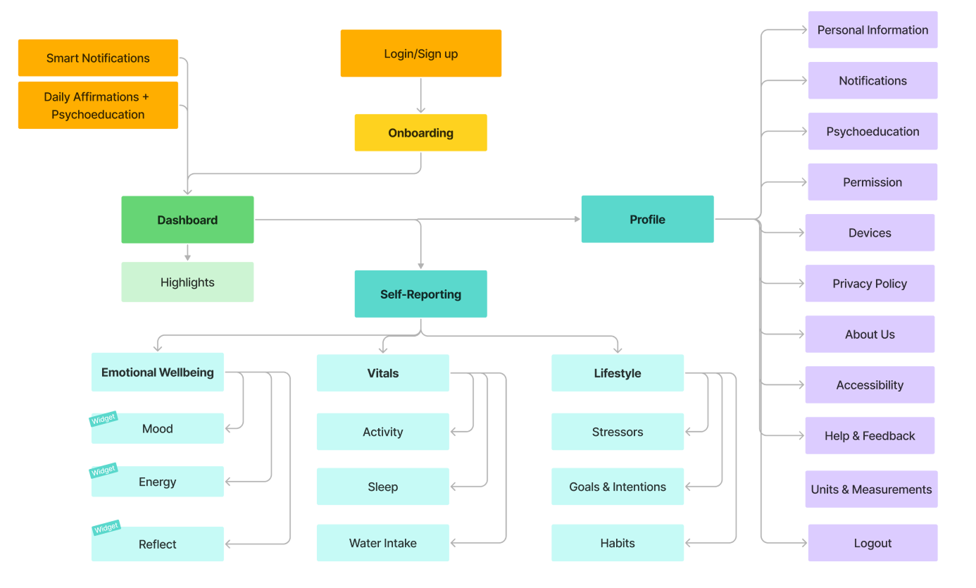
USER FLOW

sketching
I facilitated a crazy-8 session where the team could visualize and ideate how features would function and look like visually.

medium fidelity
We translated our paper prototypes into Figma, incorporating stakeholder feedback.
With guidance from the client, we refined the UX copy to align with Vitality’s tone while maintaining the sensitivity needed for a wellness app.

UX WRITING
We crafted notification copy for the sensor data or user input in Vitality’s empathetic, encouraging tone.

stakeholder input
We facilitated co-creation workshops with the client to see the prototype directly and make comments
With guidance from the client, we refined the UX copy to align with Vitality’s tone while maintaining the sensitivity needed for a wellness app.

User Testing
We asked participants aged 18-27 to navigate our prototype and provide insights on how our app can better meet their personal goals towards empowerment and well-being.
User Testing Insights
Mental & Emotional
Insight: Participants enjoyed using expressive icons (smiley faces) instead of numerical metrics for mood tracking but wanted more granular options.
Action: Add an “Other” or customizable mood choice to capture a wider range of emotions.
Physical
Insight: Users initially found the “Activity” label ambiguous but quickly appreciated the related features. They also preferred logging water intake in ounces rather than liters.
Action: Clarify the “Activity” label (e.g., rename or add a tooltip) and switch hydration tracking to ounces to match common habits.
Lifestyle & Contextual
Insight: The term “Life Factors” confused users; they couldn’t easily locate where to input their stressors or contextual data.
Action: Rename “Life Factors” to something clearer (for example, “Stress Triggers”) to improve discoverability and self‐reporting.
Dashboard (“At a Glance”)
Insight: Testers struggled at first to find the “At a Glance” section, though those who located it liked the visual insights bubble chart.
Action: Change “At a Glance” to a more intuitive label (like “Today’s Insights”) and make the bubbles more interactive (e.g., tap to reveal detail).
Profile
Insight: Users expected their profile page to display personal details (name, photo, stats) but instead saw navigation to categories like Mental, Physical, and Lifestyle—causing confusion.
Action: Redesign the Profile screen to surface user-specific information (e.g., display name, settings, progress) and move category links elsewhere or clearly label them.
Navigation Bar
Insight: The minimal‐style nav bar was well liked overall, but the “Recent” label (with its history‐icon) confused users about its purpose.
Action: Rename or replace “Recent” with a clearer term (such as “History” or “Timeline”) so users immediately understand where to find past entries.
STYLE GUIDE
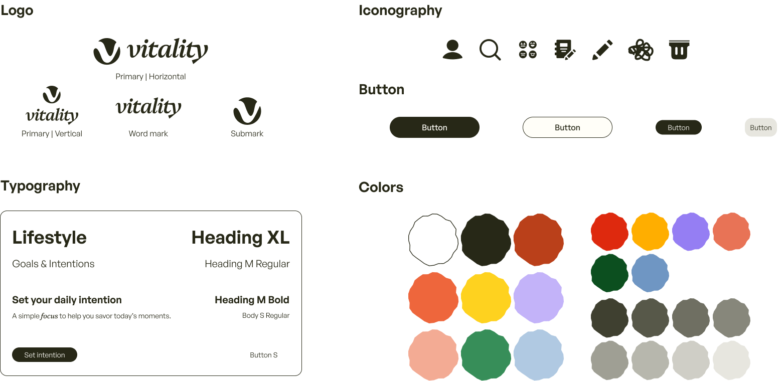


VISUAL DESIGN
We applied our style guide to the medium-fidelity designs.

Prototyping

final UI


brand in action


impact
Working with a Non-Design Client
Translating the Loyola Wellbeing & Emotion Lab’s research papers into an intuitive interface was challenging, but it taught me how to guide a client who has great ideas yet is unfamiliar with design workflows.
I had the opportunity to lead an 11-member team through a full end-to-end UX process, and I learned a ton about clear communication and effective collaboration.
Our client will use our high-fidelity prototype to pitch the Vitality concept to potential investors.
